
Dev Log 4: Words Into Art: The Concept Art Process
Dearest Community,
How do we translate words into art? That is the age-old question we ask ourselves every day at Rustling Leaves Games!
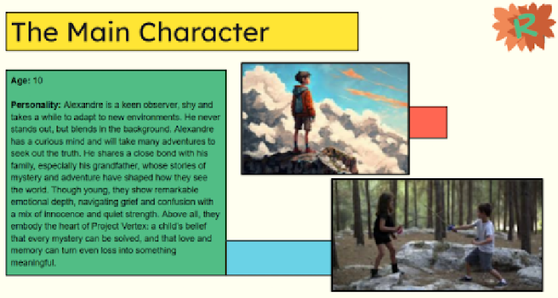
Our concept art process begins with a character or environmental description; we call it a profile. The profile defines the character’s emotional tone, descriptive factors, and personality traits. That, coupled with the entire narrative design, allows us to create something truly amazing!
We asked our team members to explain how they approach creating concept art for Rustling Leaves Games, and this is what they said…
“First, I take some time to read the game document/character description to know who the character is, what their personality should be, their role in the game, what emotion they could show… I brief the important stuff, do my own research, and develop some keywords and a description of the concept for myself.
After that, it’s time to really sketch something; I try to explore without going too far from the briefing. I explore the shape language, some clothing design, proportions, and the overall look of this character.
The next step is to choose some colors, what this color evokes in the viewer, and why it is important; maybe change the outfit, hair, small details… And when the concept is done, it is time for technical art: do the turnaround or explore angles, prepare the concept for the 3D team!”
— Gabriela
“Before I even touch the pen and paper to sketch, I like to carefully read the descriptions provided. One thing that helps me a lot is reading the entire narrative. I’m a very visual person, so I need to see things, even if it’s just in my head. While I’m reading, a lot of ideas come to me, and sometimes I put them on paper.
After that, I look at possible references, either the ones provided by the team or ones I search for on my own. I organize them into categories, such as mood, object placement, composition, etc.
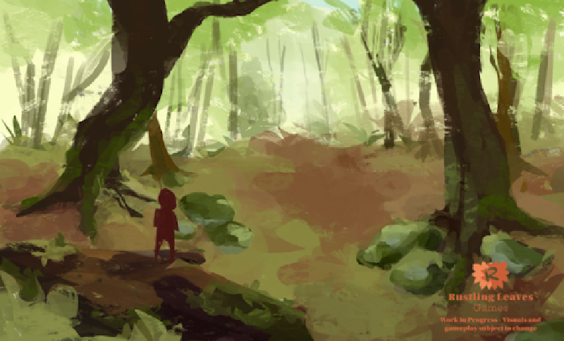
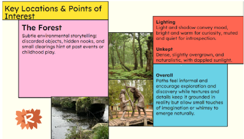
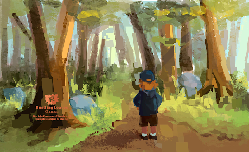
The next step is creating the concept art itself. I don’t usually follow a strict workflow, and my process can be a bit messy. Sometimes I jump straight into colors, while other times I need small value thumbnails to guide myself. For the forest environment, I used a mix of both approaches, but for the kitchen, I started with some loose lines for a base sketch.
While I’m drawing, I always keep my references within reach and constantly go back and forth on them. I also try to keep in mind the feeling I want the concept to convey. One thing I value a lot is the mood of a piece. In my opinion, concept art shouldn’t just be pretty; it should serve its purpose within the game.”
— Daniela
“As with any design, I always find the research is the most enjoyable process. When it came to the Trotson Radio, references were king.
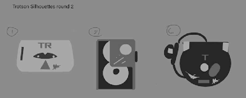
I first needed to find a design that was period-accurate and interactive. I collected references of different kinds of cassette players over the years. In particular, I would save designs that embodied the 90s/2000s spirit of the setting. It was important not to stick to similar shapes and really explore silhouettes. Below are some examples of references I pulled from cassette models from the late 70s to the CD players of the early 2000s. Despite the Trotson player intending to mimic players of the 90s, I drew inspiration from earlier decades to not limit my ideas.
My next step was developing thumbnails of differing silhouettes. Details like buttons, wear-and-tear, and other similar personal effects are put to the side at this stage. I consulted the creative team on which design was the most appealing. The result led to the majority agreeing that design 2 felt most interactive. Players needed to have a realistic interface to play music, change tracks, etc.
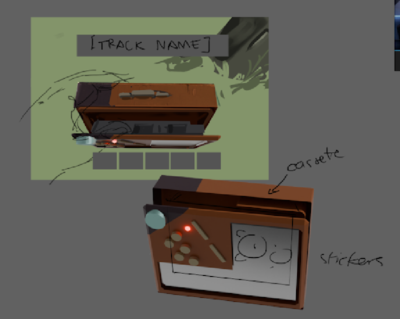
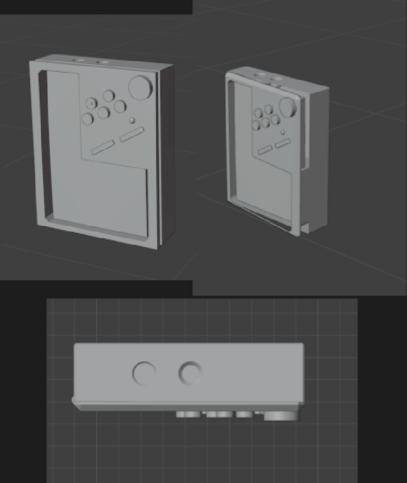
The remaining step was to flesh out how the design appears in the context of actual gameplay. Again, I spent time researching. I looked for hobbyist videos showcasing old models being used to play tapes. This influenced the appearance of tape being opened, tape being inserted, etc. It would add to the themes of taking your time and taking your surroundings to show a tape being inserted as an animation. Because it involved accessing the player from different angles, I decided to also model a 3D blockout to better demonstrate the range of interactions the player can have with the Trotson.”
— Chloe